Plan It

With endless ways to customize your degree, it can be hard to grasp all your options. Course codes can be confusing, and not all courses are offered every semester. Plan.It is a website that helps students map out their whole degree by recommending electives and minors based on their interests, prior grades, and more.


Role
Interaction Design
Visual Design
User Research

Tools
Figma
Illustrator
Miro

Team
Juliann Almario
Sam Woo

Timeline
Oct - Dec 2021

PROBLEM

Researching electives and planning out one’s degree is a tedious, time-consuming process, as relevant information is too spread out


The initial brief was to create a platform that helps GBDA students plan their electives and look up the learning objectives of their program and courses. Initial research showed that there were over 10 resources that students use to research and plan out their degree.

SOLUTION
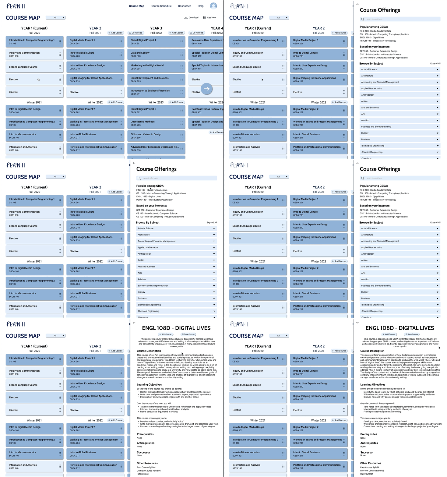
Consolidate relevant information, allowing students to make more informed decisions


Personalize course recommendations

  • Recommend courses to students based on their interests, grades, and program
pl screenshot
pl screenshot

Have detailed course summaries and student reviews

  • Every course will have a description, learning objectives, prerequisites/anti requisites/successor, and student reviews so users can truly understand what the course is about

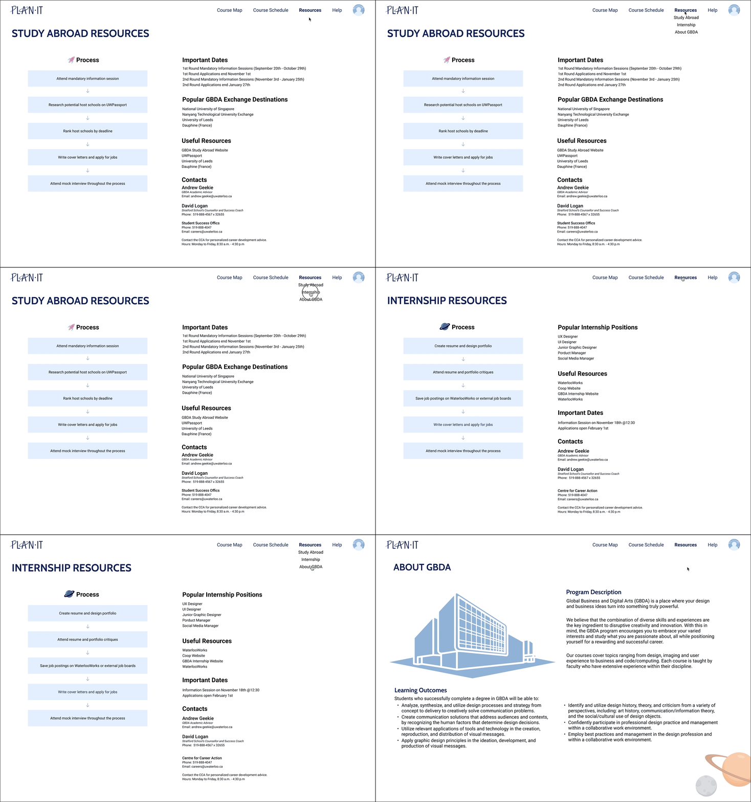
Provide resources for other aspects of student’s degrees

  • Have application timelines and important resources for co-ops, study abroad, and more
pl screenshot

RESEARCH + IDEATION

Survey + Interviews

To help us better understand our target demographic, we sent out a short survey and conducted a series of interviews with University of Waterloo students, professors, TAs, and academic advisors to gain a better idea of the current problem space.

21

Survey
Responses

07

Stakeholder
Interviews

09

User
Interviews

Key Takeaways

  1. Some students had to overload to fit all their electives, but they didn’t know which semester to overload as they couldn’t get a good grasp of coursework/courseload
  2. Students research and plan out their degrees on a laptop/desktop
  3. Newer programs such as GBDA have frequent curriculum changes, making it hard to find relevant information specific to your cohort
  4. There are specific skills that aren’t taught in mandatory courses, however, they would be very useful to have -- this kind of information is hard to find
    • e.g. GBDA doesn’t have a mandatory writing course, however, writing is an essential part of all of its courses and thus is a good skill to develop through electives


Concrete Task Scenarios

We then distilled our survey and interview results into 5 concrete task scenarios, where we described the class of the expected user, the relative importance of the task, and briefly described how the task was collected and validated. The goal was to identify key tasks that our users may do, which would help us create our user personas.

Scenarios

  1. Viewing the learning objectives for your current courses
  2. Planning out electives
  3. Researching courses for minor requirements
  4. Accessing information on studying abroad
  5. Learning when, how, and who to contact when searching for mandatory internships


List of Requirements

From there, we created a list of functional requirements for our prototype, by categorizing them into “must include,” “should include,” “could include,” and “exclude.”

Plan It Requirements

DESIGN

To start the design process, our team created a comprehensive user flow of our application using Miro.
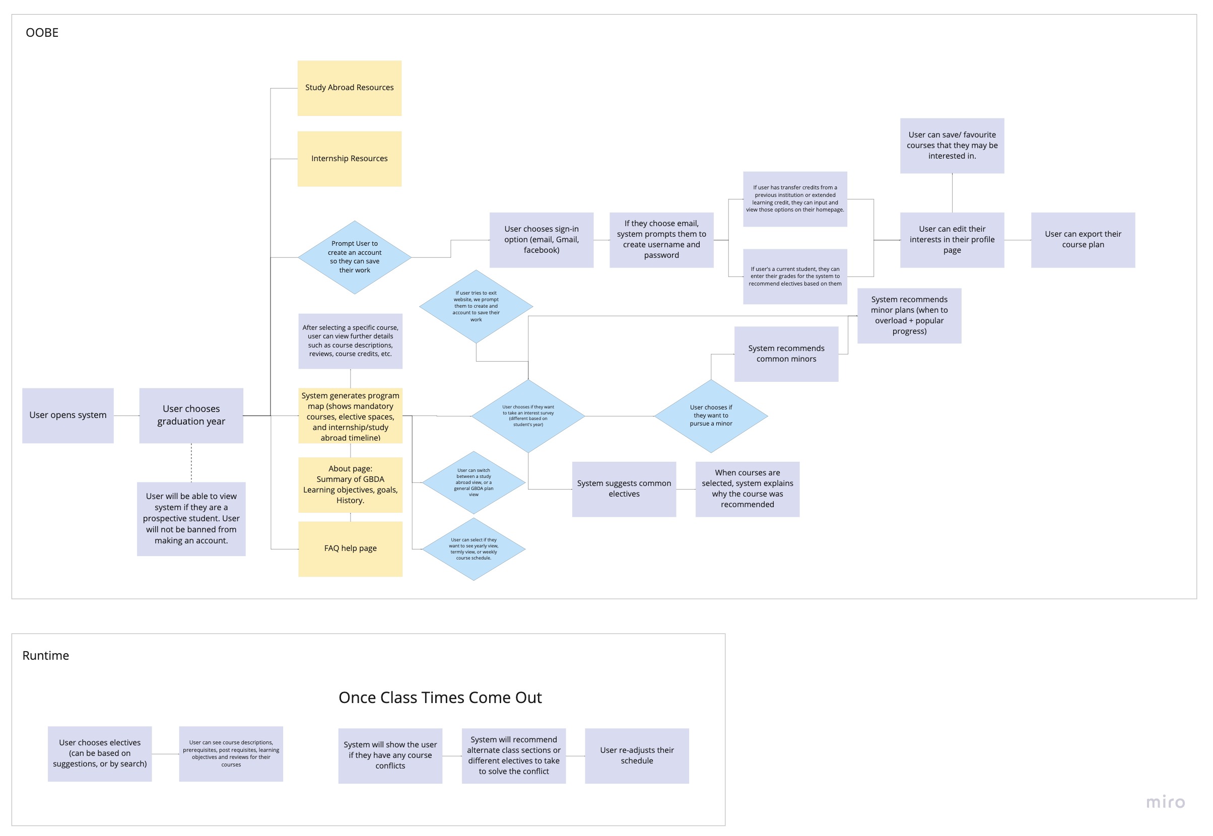
Plan It Userflow

Afterward, we each sketched out a low-fidelity prototype and then moved to combine our ideas in Figma.
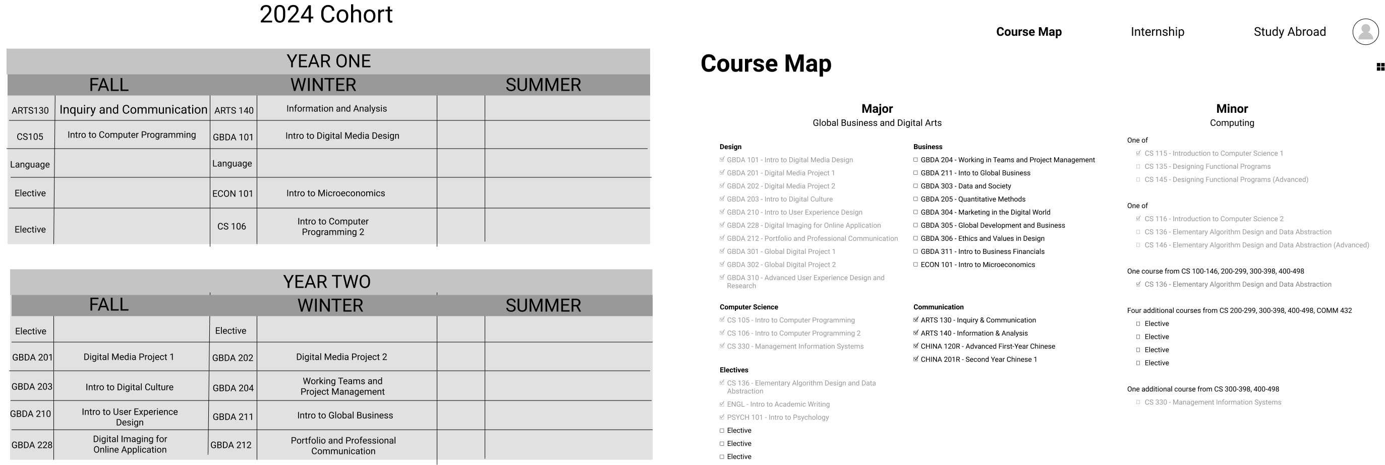
Plan It Low-Fi

EVALUATION
+ REVISIONS

User Testing

We conducted 4 individual user tests virtually. The first half of the interviews consisted of participants exploring the interactive Figma prototype by either using the think-aloud or co-discovery mode, depending on their proficiency in Figma. We identified a couple of pain points amongst first-time users, with the main issue being that we had a poor onboarding process.
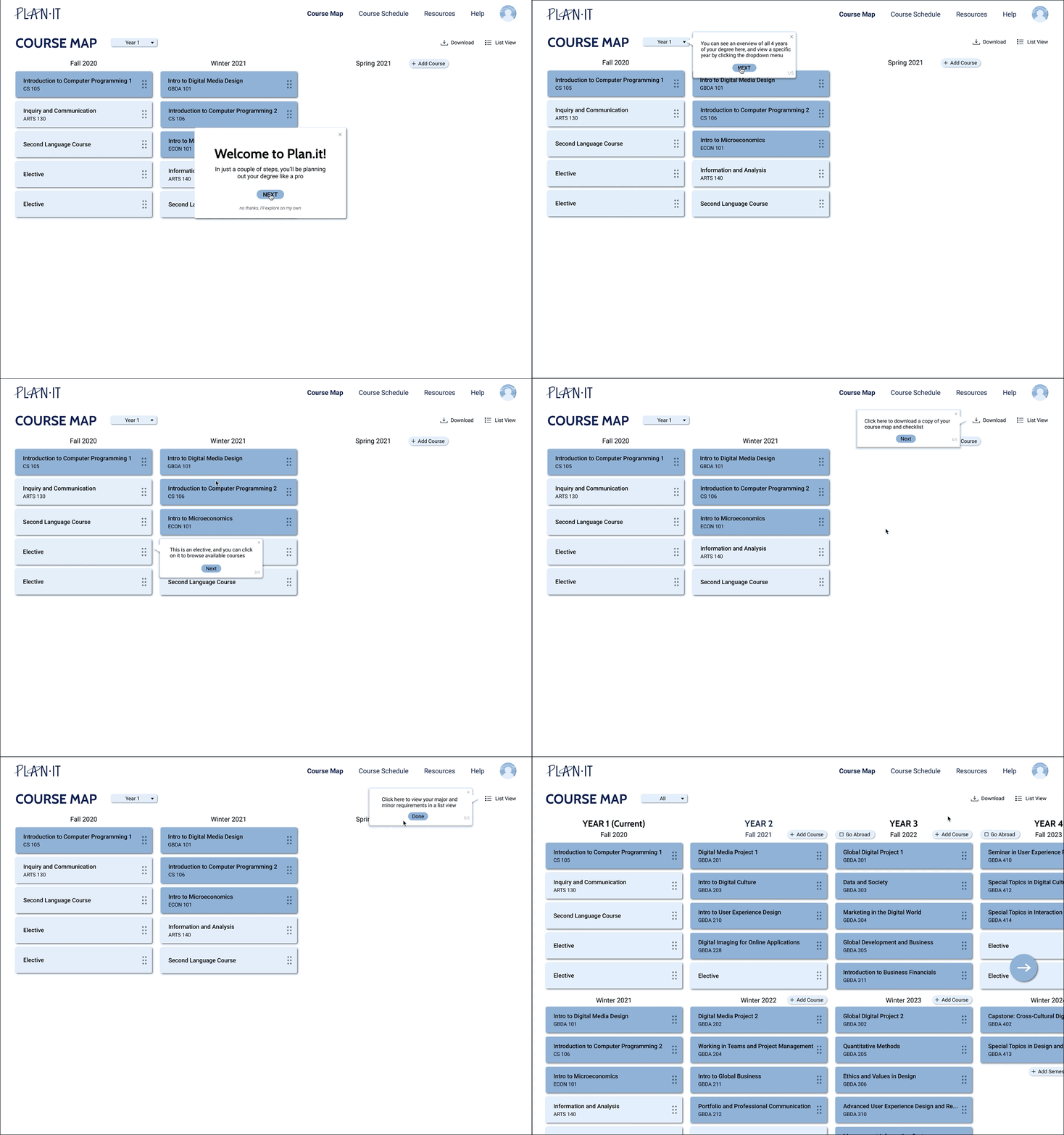

Revised Onboarding Process

  • New users found the number of features on our homepage to be overwhelming, whereas returning users appreciated the depth of information given
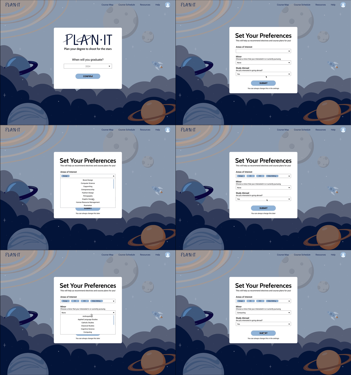
  • We added a mini onboarding tutorial after a user creates an account to introduce important features
  • We also made the homepage only display the user’s current year, instead of all 4 years for a less overwhelming start
vn screenshot
vn screenshot

Inform users of incompatible courses ahead of time

  • Users only knew if they were eligible/ineligible for a course after they added it to their course map
  • We changed this so they knew as soon as they opened the course information page, so they don’t have to continue researching the course to only find out that they can’t take it

Prioritize Saved Courses

  • Saved courses were initially under “Course Schedule,” but we realised that it would make more sense for them to be under “Course Map”
  • This is because users typically look over their saved courses when they’re choosing electives, and not when they’re looking at course times
vn screenshot

Heuristic Evaluation

We then asked our participants to conduct a brief heuristic evaluation of our prototype, where they would pick four usability heuristics and elaborate on their effectiveness within our system. We then synthesized these results into a final report that summarized, described, and ranked the identified problems using a severity rating. The main violations were with the consistency and standards heuristic, as some call-to-actions and buttons weren't clear enough so users didn't know to click on them.

FINAL DESIGN

Based on user feedback, we moved on to develop a high-fidelity prototype and a visual style guide. At this point, we were still unsure of the name, but we eventually decided on Plan It, partly because of the inherent visuals that are associated with the name, and also because we view our university journey as a time when we can shoot for the stars with unlimited possibilities (cheesy, I know).

pl style guide

REFLECTION

This project was a very valuable learning experience for me, as it was the first time that I got to experience all the steps of design thinking, as well as learn more about the world of user research, and how to conduct effective user tests and interviews. Building on that, here are my key takeaways from this project:

  1. Iterate more early on
    As we wanted to create a working prototype for testing as quickly as possible, we didn’t spend enough time iterating through different designs and layouts. Though users reacted positively to our final design, I wish we did a couple more brainstorming sessions as I feel like we didn’t fully explore all the possibilities.

  2. Spend more time preparing for user interviews
    No one in the group had experience conducting user research before, so there were definitely things that we could have improved during our user interview and testing stages. For example, we hadn't fully decided on which style of evaluation we wanted to utilize during our user tests, meaning that certain interviews were conducted with the “think-aloud” strategy, whereas the others were mainly co-discovery. Having a mix of these strategies isn’t inherently ineffective, however, we should have been more intentional with our selected strategies. Had we created a more structured interview format, we might have been able to obtain more valuable data.